
Of all the human senses, vision is one of the strongest. It plays such a strong role that colours can influence our purchasing decisions.
To make an example, Performable once run a study where they tested which color button between green and red would have the highest impact in converting users into customers.
They found that red call to action had a conversion rate of 21% higher than the green ones.
They basically managed to increase their conversion rate only by changing the colours of their buttons without changing anything else on the page.
That’s how powerful marketing colour psychology is.
The use of different colours affects human behaviour in different situations. This is what makes it possible that a simple colour change can make such a big difference in persuading users to take action rather than leave.
HOW DOES COLOUR PSYCHOLOGY WORK?
But why exactly does this happen? How is it possible that just one colour can influence so much human behaviour?
And how do you know the colours to use to increase your leads and conversions?
Why?
This comes from the fact that we all grow up associating smells, sounds, and yes colours to actions, feelings, emotions.
Let’s think about this; what if we say “love”? What is the first colour that comes to your mind associated with the word Love?
We can safely guess it’s probably the colour red.
That’s because red is the colour that is usually associated to love.
Red hearts, red roses, and so on.
So, when it comes to choosing the colour of your brand or buttons on your website, your favorite colours may not be the best choice.
That’s because your perceptions of your favorite colours might not be the same as the ones your audience has.
It’s hard to ignore our own personal preferences. We all have our favourite colours.
So, we all often tend to make colour choices based on what we like or we think will look good, instead of trying to pick those that are most in line with what we want to achieve.
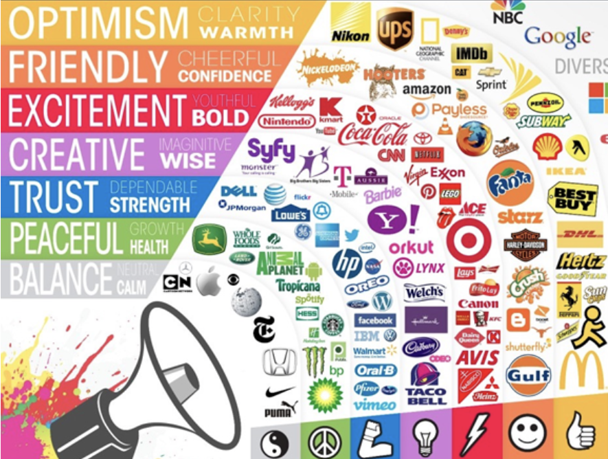
So, in this article, we am going to walk you through the primary colours, explaining their emotional impact, and show you how some brands are using them.
What is colour psychology in marketing?
Colour psychology is that scientific area of research that studies how colors actually influence human behavior.
Different colours are associated with and stimulate specific emotions and actions.
That’s why colour psychology is so powerful in digital marketing if used correctly.
What are the driving emotions that positively influence your target audience towards trusting your business and make purchases?
How do they need to feel to follow the journey you want them to take instead of leaving and searching for someone else?
The choice of the colours you use for your branding and marketing should be based on this if you want to increase your sales and customers’ loyalty.
This is why colours can impact the way audiences perceive brands in ways that aren’t always apparent.
You should also keep in mind that colours are just a portion of your brand’s experience.
There are a lot of other factors in play like your fonts, your design style, your products, and even your people.
All these elements work together and influence the effectiveness of your image and marketing.
In this article, we are going to focus on colours. So, let’s begin.
COLOUR PSYCHOLOGY: BLUE
A positive association with blue is that it can have a very calming effect.
Cool colours in general tend to have a more calming impact on people and are great for giving off a relaxed, serene, or “trusting” effect.
Try to imagine to be staring out at a nice blue ocean and seeing the calming waves and enjoying the serenity.
How would that make you feel?
Blue is also associated with wisdom, strength, and trust.
Companies such as Facebook and Twitter use the colour blue in their logos to symbolize unity and connections to others around the world.
They use the colour blue to transmit that their platforms are trustworthy places to engage with your friends.
Other companies like PayPal, American Express, and Visa which really want to gain your trust, often use the colour blue.
On the other hand, bear in mind that a dark tone of blue can be associated with coldness and a lack of emotion.
COLOUR PSYCHOLOGY: RED
Red is a powerful colour with some great positive associations.
It is often considered a powerful colour that represents leadership.
Since red is associated with power and passion, it can increase levels of Urgency and Excitement.
This is the reason why you can often see it associated with fast cars and lingerie.
It facilitates to draw in attention because of how well it stands out, which helps take action by how stimulating it is.
Netflix uses the colour red to transmit this level of excitement and passion that you can experience while enjoying their platform.

Coca-Cola is also another company that uses red in their logo and branding. The colour red helps portray a culture of excitement, leadership, and innovation in their brand.
On the other hand, very dark tones of red can transmit negative levels of energy like anger or danger.
However, warm colours like red are great for creating any type of boldness and excitement in your content.
COLOUR PSYCHOLOGY: YELLOW
The colour yellow is usually associated with being bright, are we right? And if you think about bright colours, yellow is probably the first one that comes to your mind.
But if used appropriately, it can also have a profound effect.
The colour yellow can stimulate feelings of optimism, intellect, and positivity for your brand.
It is also associated with sunshine, happiness, and fun.
So, if your audience is looking to experience some of these feelings with brands like yours, then yellow will definitely help you transmit it.
On the other hand, keep in mind that yellow can also be associated with cheapness. People usually expect to see good deals when they see the colour yellow.
For example, one of the most recognizable brands that use yellow is McDonald’s. And of course, they associate their brand with cheapness, happiness, and fun.

This is another great job of a brand harnessing the power of yellow.
However, be aware that dark tones of yellow can portray emotions of fear or anxiety. So, it’s best to recognize what shade of yellow you can use if you want to use this colour in your marketing.
COLOUR PSYCHOLOGY: ORANGE
The colour orange is often associated with the sun which gives off a feeling of warmth.
In some cases, orange can be seen as a “friendlier” version of the colour red. In fact, it often helps create a sense of movement, which is great for content where you want to induce your audience to take action.
Also, orange is a colour that most people consider to be cheap. Like yellow, but a little different.
Let’s think about this; if you think about really high-end expensive items, you probably don’t think of the colour orange, do you?
Amazon is a company that uses the colour orange in their branding.

When you think of Amazon, you probably associate it with really good customer service – which is the warmth and friendliness of orange.
They are also known for having great deals which they use to their advantage by associating their brand with being cheap.
With orange, you can also transmit spontaneity.
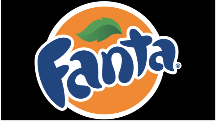
Brands like Fanta use this colour to help them induce a youthful culture for their brand.
Orange offers a good balance between red and yellow. It isn’t overpowering but also helps your brand remain energetic.
On the other side, a dark tone of orange can be associated with frustration and immaturity.
Learn +50 Powerful Neuromarketing Principles to Boost Your Engagement and Your Conversions

COLOUR PSYCHOLOGY: GREEN
Green is a relaxing colour that is easy on the eyes.
It can be used to transmit serenity, quality, and peacefulness to your audience, depending on your industry and offer.
Oftentimes, if you think of the colour green, you may think of nature.
And something positive that green is associated with is health, freshness, and growth.
So, if you were a company that specialised in outdoor gardening tools, then the colour green could help you transmit your brand as responsible and stable.
However, other times you may think of money when you have the colour green in mind.
So, if you’re in the business of money like finances, accounting, or banking then green could be a good choice as well.
One of the most popular brands that use green is Whole Foods.

They focus on healthy and natural foods and they use the green in their logos to help transmit those characteristics about their brand.
However, on the other hand, dark green can be associated with boredom.
COLOUR PSYCHOLOGY: BLACK
Black is a powerful colour with a strong association with luxury, sophistication, substance, elegance, and formality.
Think of a black-tie event or a premium ride on Uber. Black has an exclusive feeling associated with it.
It can be a great choice if you want youre branding to evoke elegance and classic style.
So, if your business is in luxury goods, you might want to use the colour black to portray your brand as high quality to your audience.
The colour black can also represent class and timelessness – reason why some of the world’s largest companies have black logos.
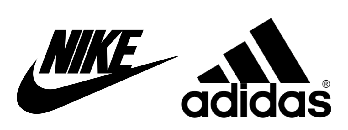
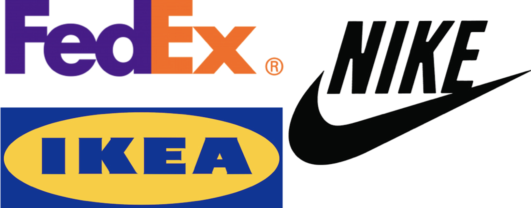
Nike, Adidas, Disney, and even Apple have black logos and these companies have stood the test of time.
On the other hand, black can be associated with coldness, evil, oppression, and even death.
Black is in fact one of the hardest colours to execute properly because you normally need other psychological influences as well.
COLOUR PSYCHOLOGY: WHITE
The colour white is quite similar to the color black in the sense that it represents simplicity and elegance but in a more subtly.
White is usually associated with being modern, sleek, and clean.
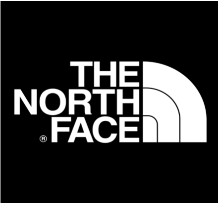
Companies like The North Face use this colour in their logos to transmit an easy, fresh, and clean quality about their brands.
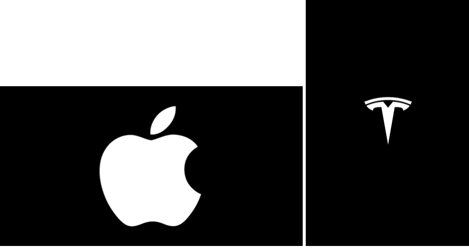
As do brands like Apple and Tesla, which take advantage of white because of their ability to demonstrate easy, fresh, and clean quality with their entire brand experience.
On the other hand, if poorly executed white can look very lazy, plain, and lack personality.
COLOR PSYCHOLOGY: PURPLE
The colour purple can be seen as soothing but also regal, luxurious, and creative.
So, if your brand wants to transmit an imaginative culture, you might want to use purple as part of your branding.
Companies like Yahoo use purple because it induces a feeling of an imaginative, creative, mystical, and ambitious culture with regards to their brand.
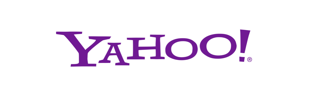
Purple is also a mix of red and blue, which gives it qualities that help create stimulation, imagination, serenity, and trust thanks to the good balance of both colours.
On the other side, purple can be negatively associated with moodiness as well.
COLOR PSYCHOLOGY: PINK
The colour pink is a variant of red, meaning that it can stimulate love as well as respect.
It is, however, more commonly associated with something feminine.
Victoria’s Secret and Barbie are two major brands that use pink as a strong part of their branding. This works well for them as they target girls and women.

On the other side, if not used properly, pink can be associated with weakness.
COLOR PSYCHOLOGY: BROWN
When you think of the colour brown, you may think of chocolate or of something different based on your own experience.
Said so, in many instances the colour brown tends to represent a rugged, earthy, or outdoor image.
It is also portrayed as dependable, reliable, and friendly.
All characteristics you might associate with one company that uses big brown trucks.
Yes, that’s right, UPS.

This is why UPS is so recognisable. Their big brown coloured trucks help be easily recognisable and associated with dependability. It also helps influence and strengthen their overall brand image.
On the other hand, brown can be seen as conservative or dogmatic in some negative contexts.
How much should you invest in Digital Marketing?
Importance Of A Colour Palette
So, now that we have seen the general perception of the most used colours, let’s see something about a colour palette.
To be honest, having a colour palette is the best option if you want your brand to stand out and if you need to transmit multiple feelings to your target audience.
When it comes to determining what colours you will want to choose those that make your ideal clients feel the way they need to feel to trust and follow your brand.
And your image must reflect that if you want to set the basis of a long-lasting relationship with customers and induce them to take action.
So, paring certain colours together can give a different connotation than the colours on their own.
Colours can help make a stronger emotional connection with your target customers.
Do you want to implement color psychology to get high-converting marketing and branding?
Serendipity Marketing is expert in empowering digital marketing with psychology science.
As digital marketing agency London, we work following a unique methodology that allows us to uncover any business target audience driving emotions and empower digital marketing to make the right emotional impact on them.
Rely on an expert emotional digital marketing agency London, such as Serendipity Marketing, to get high-converting marketing and branding.
")